on
Evaluating user experience for startup founders
Note: This was originally published in UX collective
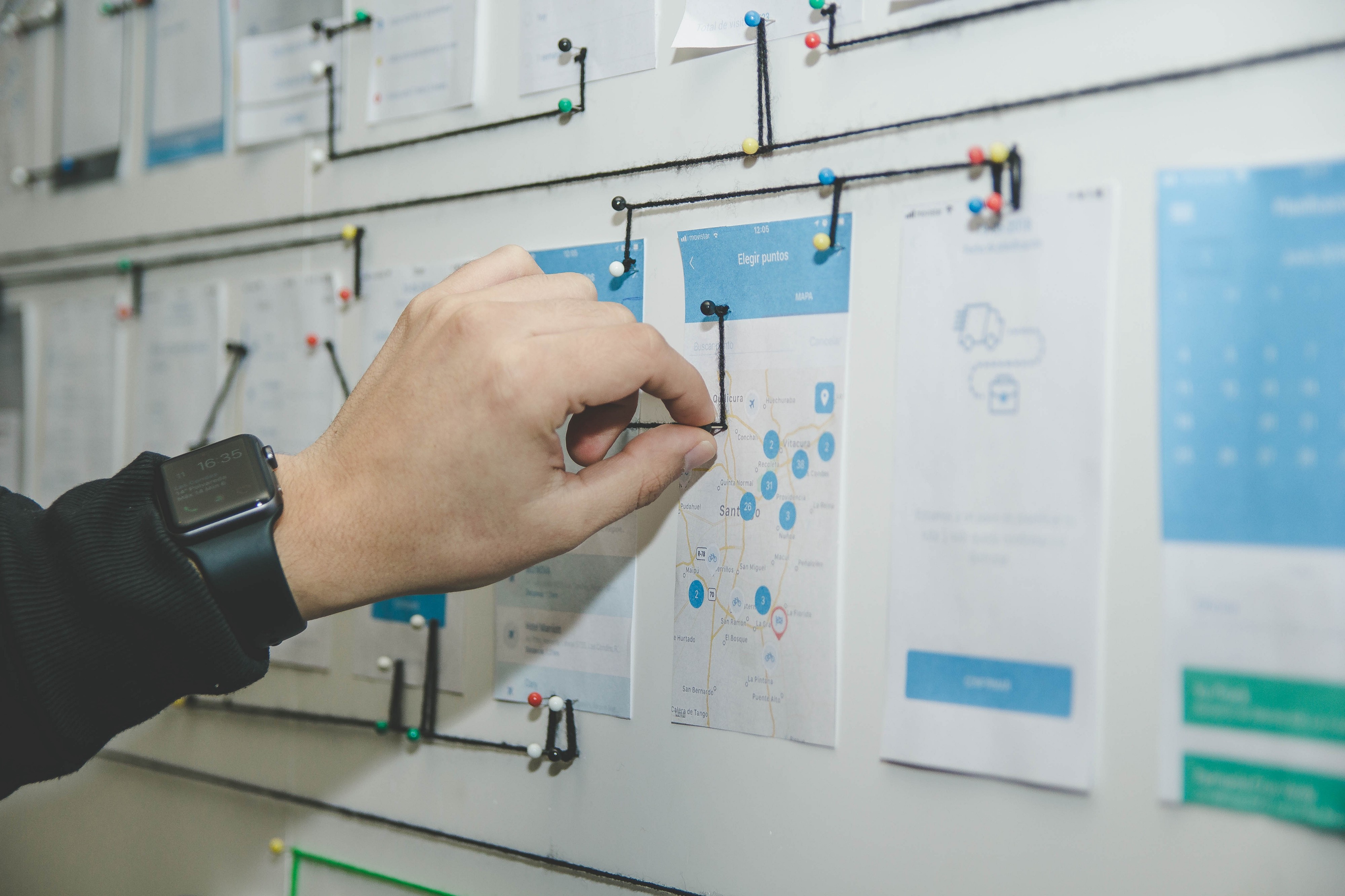
At some point in your life as an entrepreneur, you’re going to have to look at wireframes or mockups. Whether or not you’ve had a hand in crafting them, you’re going to be asked your opinion about them, which can be a daunting task at times. Ideally, you want to get your designs in front of users as quickly as possible. But there is going to be a time early on in products development where you need to make judgements about a design before you’re able to get it in front of your target users.
How do you know what a good user experience(UX) is, and how do you identify it in your mockups and prototypes? You’ve probably been looking at this project for a while now and knowing what it would look like to fresh eyes is not going to be possible. If you’re not careful, you’ll resort to nibbling around the edges of a design: making tiny tweaks about fonts or colours.
Those aesthetic details are important from a branding perspective, but aren’t going to make or break your app from an experience point of view. This article isn’t here to convince you the importance of UX, I’ll leave that to the fine folks at Forbes. What this article aims to do is to give you a few basic questions that will allow you to judge whether your app is providing a good user experience to your customers, hopefully before you find out the hard way in production. They key to thinking about UX is to think about it as communication, that is, what is your app saying to your customers.
Here are questions you can ask yourself (or your designer) to figure out whether you’re giving your users the best experience:
What’s the most obvious thing to do on this screen?
Let’s try a little exercise. Open your phone and open up an app, any app, and look at whatever screen you’re on for two seconds (make sure to count them). Then close the app.
Now that you’ve done that, name all the things that you could do on that page. Don’t list the buttons or headers. Name the specific actions you can take. Things like: login, make a post, edit your account. Now look back to that same screen and count all the things that you can actually do on that screen. Chances are, you missed a few things, which is fine if those things aren’t something that you really wanted to do or are things that you will rarely do.
Now think about this exercise in terms of your own app. Is the most obvious thing to do on this screen the thing that users are most likely to want to do? If it’s not, your users are going to be frustrated as they search for the action they want to take. Maybe there is something wrong with your app’s visual hierarchy. Keep in mind that you took two seconds using your full attention. A user might be glancing at your app while they are running to catch a train. You need to communicate actions clearly to the user and make sure that you have a small number of options. Otherwise users might get confused or get lost in your app.
What are the user flows in this app?
Beyond what you can do on an individual screen in your app, is what you can do in your entire app. This is going to vary a lot depending on what your type of app does, but every app is designed to do something. You can think of that something as an objective that your user has. Does your app design allow your user to reach that objective as quickly as possible? Are you putting up unnecessary obstacles in front of you users?
The process your users takes in your app is called a user flow. Some UX designers will start with flowcharts that describe user flows (they might even show them to you). Thinking about your app designs in terms of user flows is a good way to reason about designs that is agnostic about how your app looks. If you have a problem with user flows, there is no amount of tweaking fonts or button sizes that is going to fix it.
To think about user flows, it’s good to think about how you accomplish something in the app, without actually doing it. Imagine your favourite social media app. Whatever you pick doesn’t matter for this exercise. Without opening or looking at the app, think about the specific steps you would take to:
-
Search for a specific user.
-
Find a post you saw a week ago that you liked, favourited, etc.
-
Add a person you just met as a friend, connection, etc.
The process you’re going through in your head to accomplish those tasks is the user flow. You’re probably not imagining specific screens in your head, but you are thinking about places in the app and actions you need to take. If you can think about your own app that way, the user flows will become more apparent.
Could I navigate in this app if I could not read the words on the screen?
In UX, it’s generally better to show rather than tell the user what to do. Users read a shockingly small amount of text when using the web. Having a lengthy explanation about how to use your app is not going to cut it.
To get a good sense of UX without words, try using an app in a language you don’t understand. In this case, the more far removed the language from ones you understand, the better. If you’re an English speaker (and I suspect you are if you’re reading this), don’t just find an app in Spanish. Find an app in Arabic, or Russian if you don’t speak those languages. Hopefully you can find an app similar in functionality to yours using something like fnd where you can see the contents of global apps stores. See if you can navigate around and find things in the app. You might be surprised at how much you can achieve.
In your own app, you might want to try looking at your design with text replaced with lipsums (the faux Latin dummy text used in the print industry). See if a fresh person can navigate the app without helpful text hints (or even yourself). Admittedly, this exercise is going to be much less useful if your app is highly specialised or uses uncommon patterns or data, like a business to business app. But for more consumer focused apps, you can get a fresh perspective on your app’s experience.
UX is a journey that your app is constantly undertaking. By asking these questions, you can make more reasoned judgements about the user experience of your app (and other apps) before you have users to test your initial designs on. Spotting poor UX early can save your users future frustration.